Optimization of the platform's Home Page
Home da plataforma é o principal ponto de contato diário de milhares de alunos. No entanto, o design anterior apresentava uma estrutura que dificultava a descoberta de novos conteúdos e a organização da rotina de estudos.
O Desafio: Identificamos que a interface sofria com uma escala ineficiente de componentes, gerando um scroll excessivo que escondia informações vitais "abaixo da dobra". Além disso, não havia uma hierarquia clara entre o que era progresso de estudo, eventos ao vivo e ofertas estratégicas, gerando um alto ruído cognitivo.
Minha Missão como Product Designer, liderei o redesign desta experiência com o objetivo de transformar uma página meramente informativa em um hub funcional.
Para o Aluno: Facilitar a organização e o progresso nos cursos.
Para o Negócio: Aumentar a visibilidade de lançamentos e engajamento com a comunidade.
Project type
Product Design • UX/UI Design • UX Research • Design Strategy
Local
Brazil
Data
2024
Prazo
4 Semanas

The Challenge and Context
The objective of this project was to create a new experience for the platform's Home, focusing on understanding the usage pain points and identifying which information would generate real value for the student.
Identified Problems:
Inefficient Scale: Excessively large components forced unnecessary scrolling, hiding vital content below the fold.
Lack of Prioritization: Shortcuts and recommendations were not optimized according to actual usage, making fast navigation difficult.
Diagnosis and Data Analysis
To support design decisions, I conducted an immersion in user behavior data through Microsoft Clarity. We identified that the current home was suffering from cognitive noise and interactivity failures:
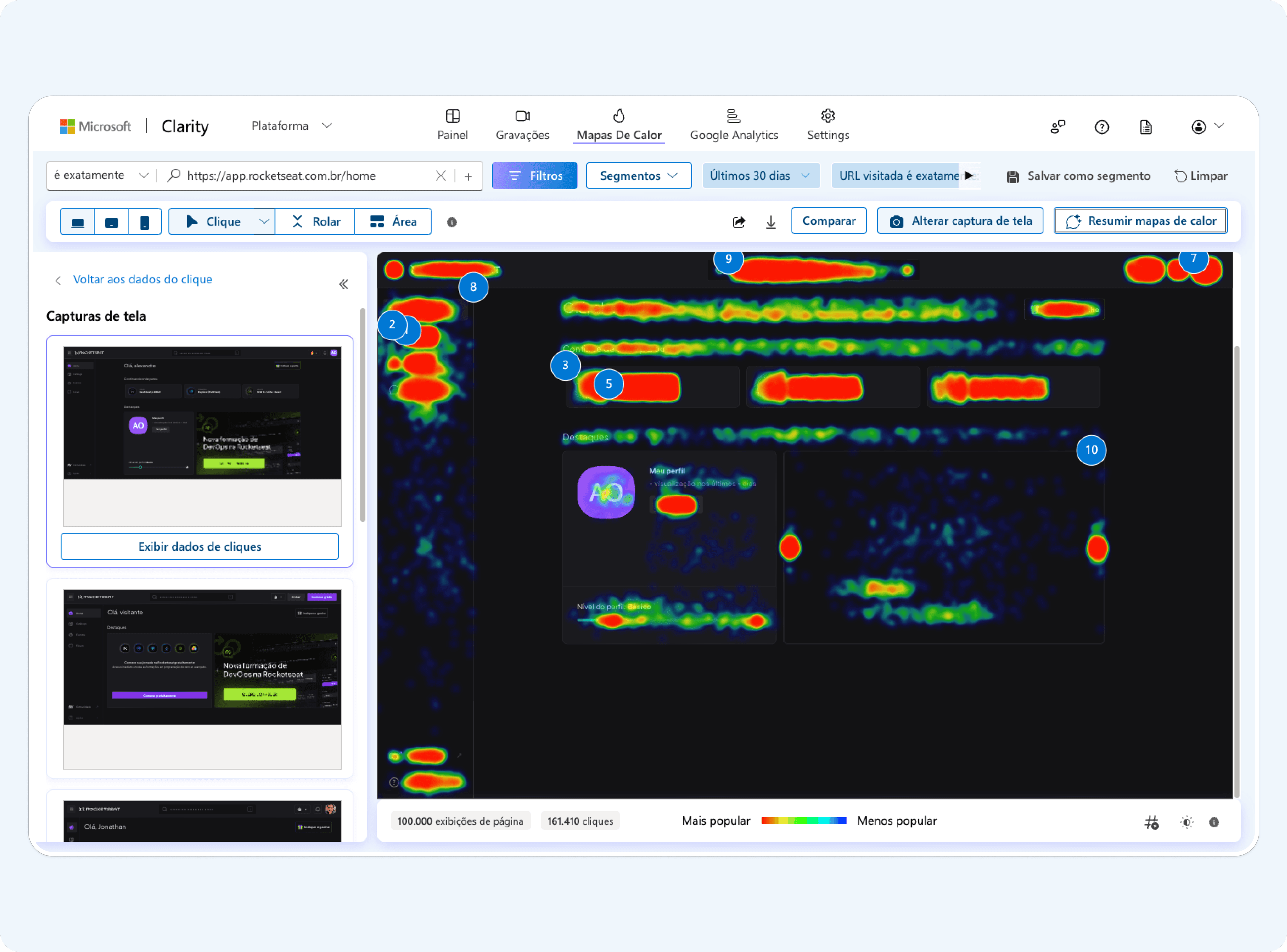
Dead Clicks: Desktop users frequently clicked on non-interactive elements, indicating a lack of clarity in the layout.
Scroll Bottleneck: On tablets, 85% of engagement occurred only at the top of the page, with a drastic decline in attention to content below the fold.
Scale Problem: Excessively large components forced unnecessary scrolling, hindering access to quick information and prioritized shortcuts.
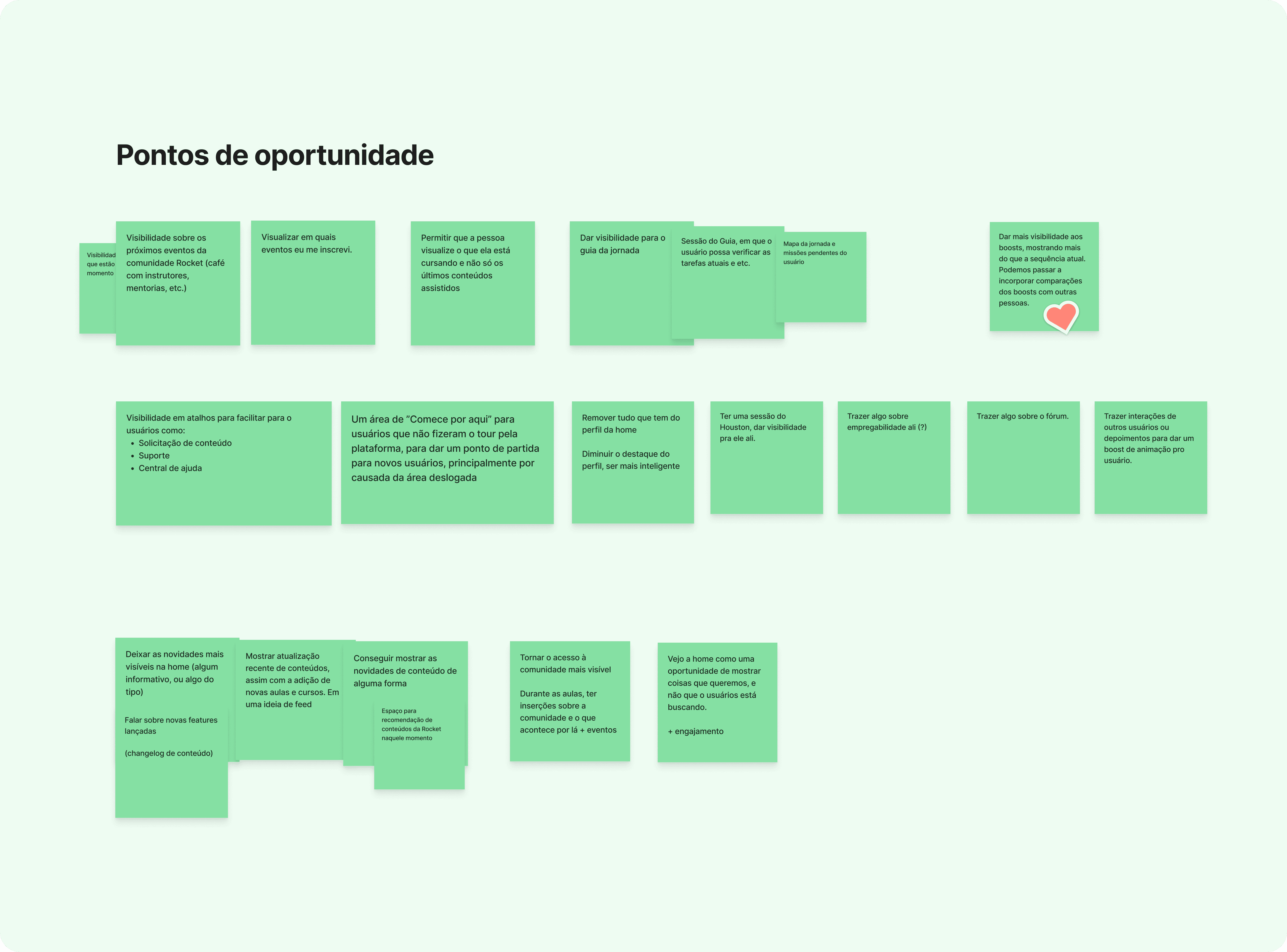
Strategy and Prioritization
The Co-Creation Dynamic
As the Home is a convergence point of various business interests, I led a Ideation Workshop in FigJam alongside the PM of the team to align expectations and gather insights. I gathered representatives from key areas such as Product, Customer Success, Community, and Education, ensuring that the new experience met both user needs and strategic objectives of each department.
This collaborative approach allowed:
Mapping Hidden Needs: Identifying that the Education area needed more visibility for launches and that marketing needed space for strategic offers.
Building Consensus: By involving everyone in the ideation process, we reduced approval barriers and ensured that all sectors were aligned with the new information hierarchy.
Collective Prioritization: We used the suggestions brought up during brainstorming to feed our prioritization matrix, separating what was essential for the MVP from the improvements that could be implemented in the future.
With the mapped problems, I structured a Prioritization Matrix to ensure that the redesign delivered immediate value to the business and the student:
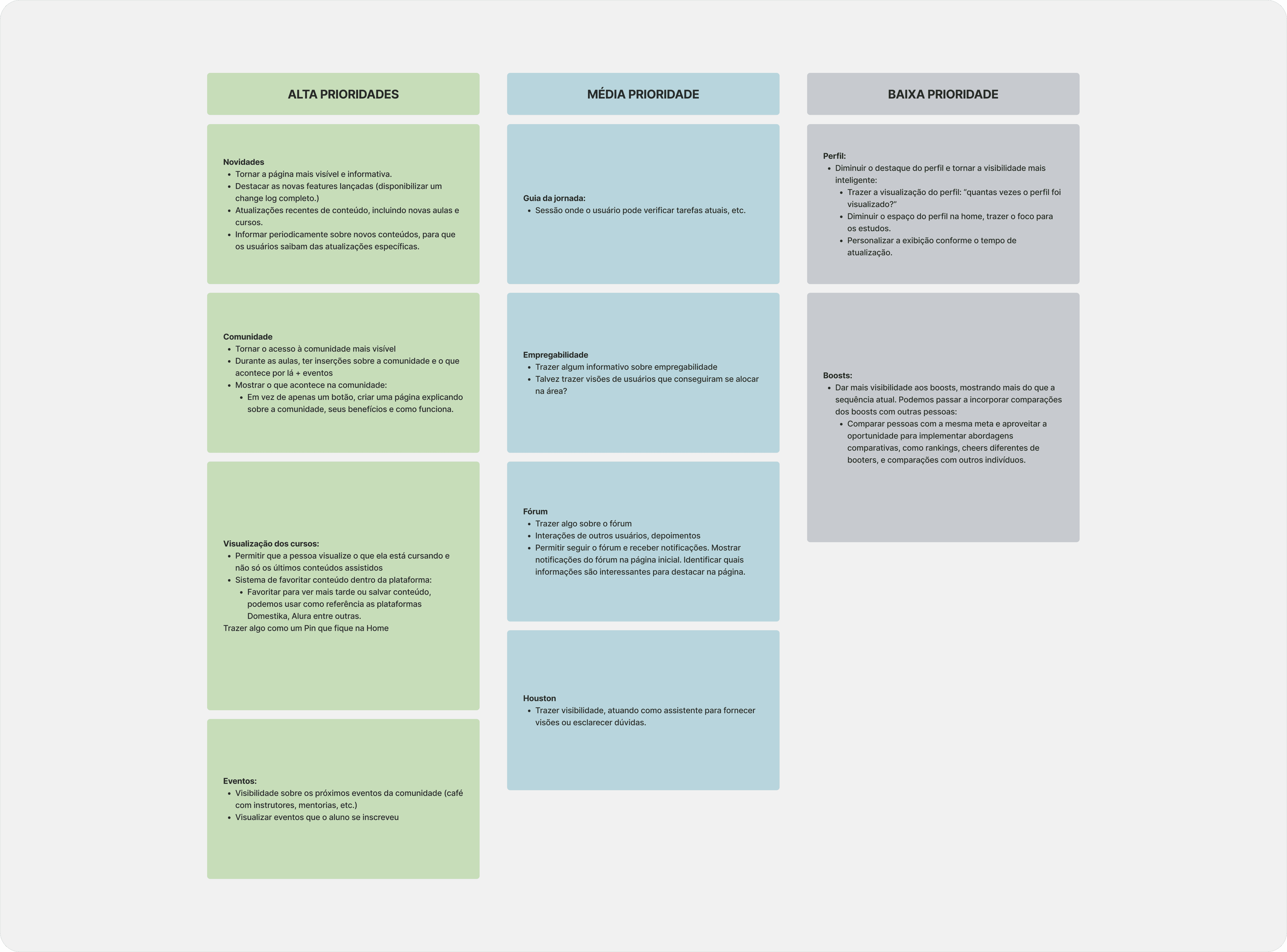
High Priority: We focused on making novelties more visible, facilitating access to the community, and creating a system to 'favorite' content, similar to platforms like Alura and Domestika.
Space Management: We decided to reduce the visual prominence of the user profile to prioritize the 'Continue where you left off' section, focusing on educational progress.
Emotional Journey: We mapped the user's journey in three acts (Discovery, Engagement, and Reward), ensuring that functions like 'Refer and Earn' generated satisfaction at the end of the task.
UI Refinement and Low-Fidelity Wireframes
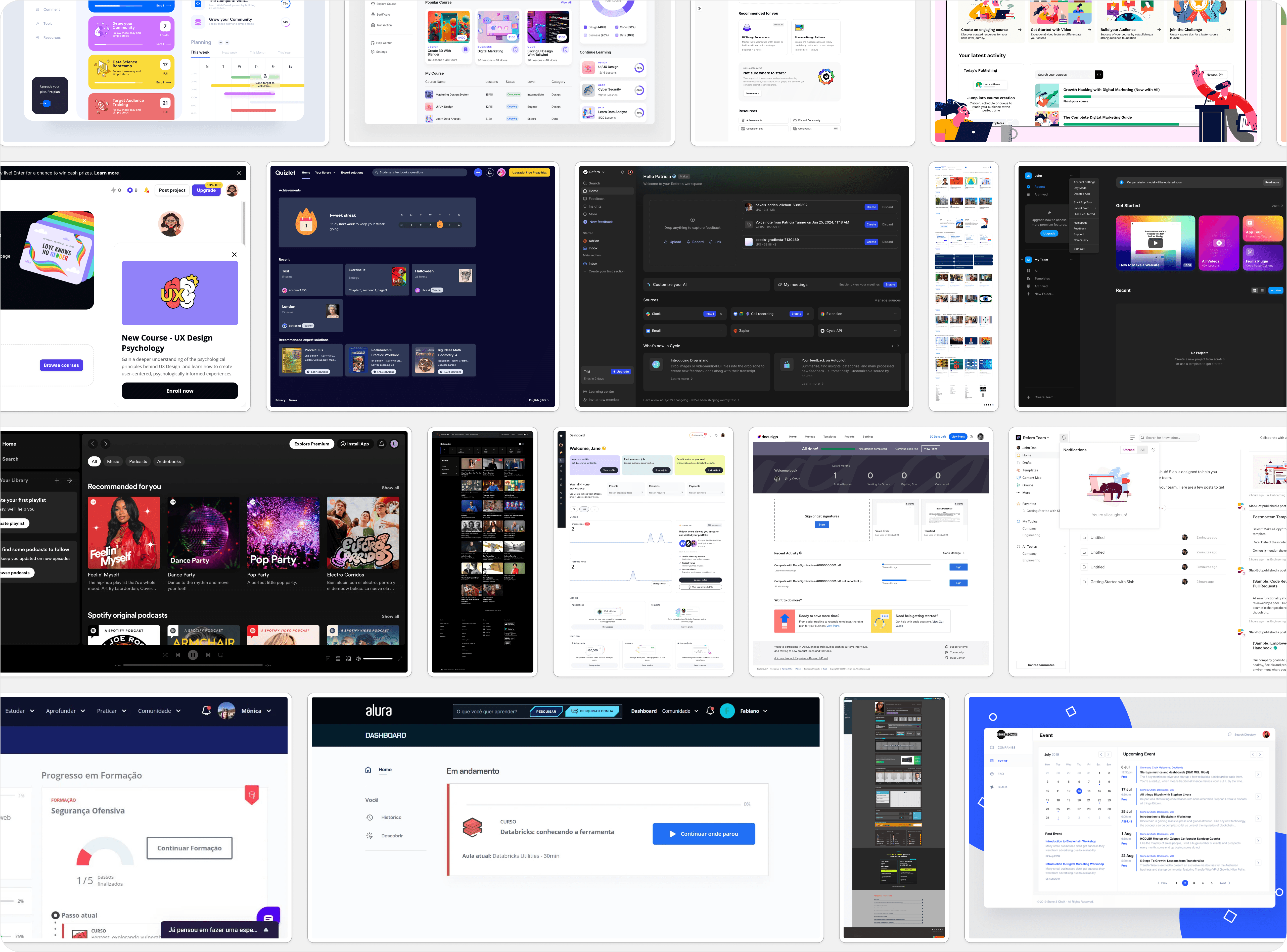
Benchmarking and Market References
After the Discovery phase, I deep-dived into market research to understand how major education players (like Alura and Domestika) handled the organization of dense content. The objective was to collect usability patterns that were already familiar to our users, reducing the learning curve of the new Home.
Ideation and Low-Fidelity Wireframes
With the references in hand, I drew the first skeletons (wireframes). At this stage, the focus was purely structural: testing where each element (calendar, ongoing courses, community area) would be positioned to ensure that the most important information was always visible "above the fold."
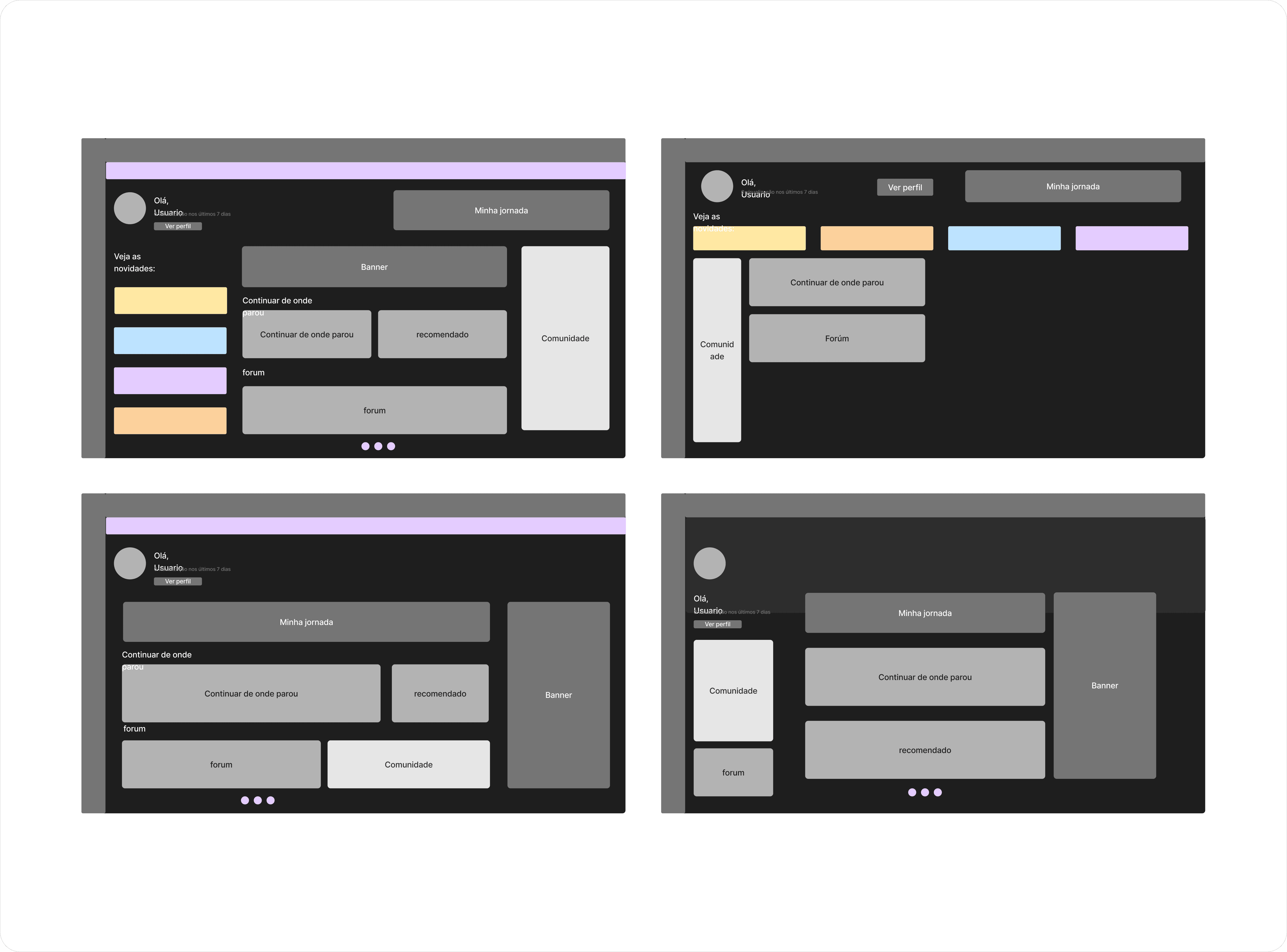
Agile Iteration with Design System
Unlike a traditional and lengthy process, the transition to high fidelity was extremely agile. Thanks to our consolidated Design System, we were able to skip manual steps and focus on experimentation.
Multiple Versions: I created several medium-fidelity variants of the Home quickly, testing different compositions of cards and side layouts.
Consistency and Speed: The use of ready-made components allowed the focus to remain on strategy and experience (UX), not just aesthetics (UI), ensuring that each tested version was already aligned with the brand's visual identity.
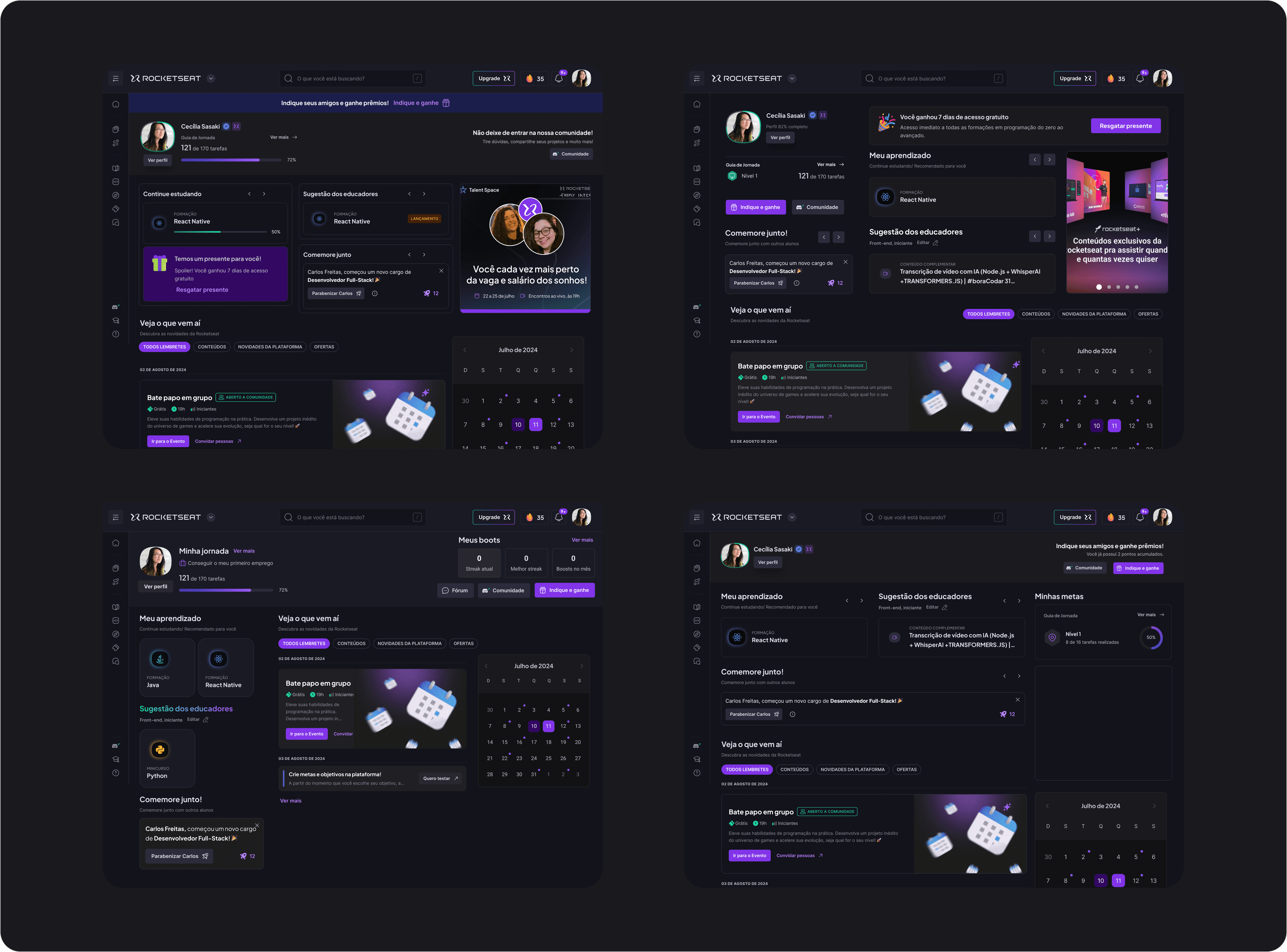
Highlights of Technical Refinement:
The transition to high fidelity was enhanced by the use of a consolidated Design System, allowing us to focus our efforts on a meticulous Design Review and rapid iterations. The goal was to refine the interface to ensure clarity and efficiency.
Highlights of Design Evolution:
Information Architecture and Hierarchy: I refined typographic weight and contrast to clearly distinguish event dates, session titles, and content categories. This visual separation eliminated the cognitive confusion present in the previous version.
Space Optimization: We resized the cards for a more balanced scale. This allowed for greater density of information above the fold, reducing scrolling without sacrificing breathing space and elegance of the interface.
Componentization and Functionality: We implemented dynamic filters in the "See What's Coming" section, transforming a static block into a personalized navigation tool. In addition, the new calendar component centralized events and offers, strengthening the sense of community and urgency.
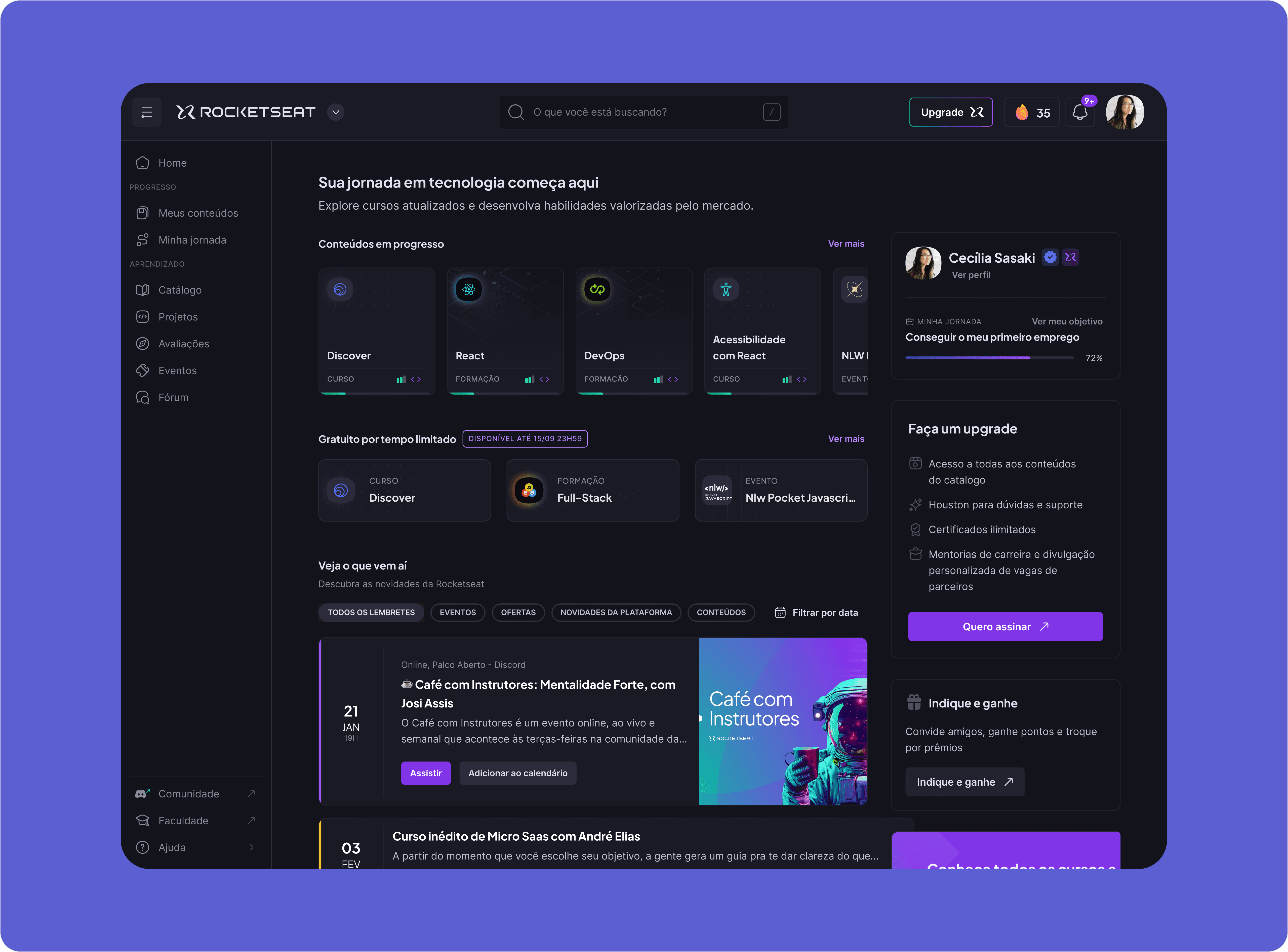
Final version:
Results and Conclusion
One of the indicators of success of this redesign was the validation of the Reminder Calendar component. It was designed to be the heart of the student's organization, centralizing events, offers, content, and news from the platform.
What the usage data revealed:
Engagement with the novelty: In the first week, the volume of interactions was exceptionally high, validating students' strong interest in an organization tool.
Habit Formation: After the launch peak, the use of the calendar stabilized at a constant level. This demonstrates that the functionality was not just a passing novelty but became part of the user's daily study routine.
Home Efficiency: We managed to transform a page that previously generated doubts and lost clicks into a useful and predictive interface. The centralization of information reduced the need for students to seek notifications through other channels, making navigation much smoother.
Conclusion
This project showed that combining behavior data (such as heat maps) with a strategy of alignment between the areas of Product, Education, and Marketing is key to a solution with impact. The final result delivered a more organized experience, where the student finds what they need with less effort, prioritizing what truly matters: their progress in learning.