
2025
Redesign of Front-End Developer Portfolio
A personal project of professional and visual repositioning.

Thiele Santana
Product Designer
Context
Transforming a technical portfolio into a personal and inspiring experience.
The goal of the project was to reposition the portfolio as a modern, reliable platform with a more mature language, reinforcing purpose, clarity, and differentiation in the technology market.
Problema
A functional portfolio, but without purpose and emotional connection.
The previous layout had a good technical foundation, but some points hindered the perception of value:
Limited visual hierarchy and very heavy titles.
Not very fluid structure between sections (“Projects”, “Skills”, “About me”, “Contact”).
Absence of personal tone and purpose in the textual content.
Lack of typographic consistency and spacing between blocks.
These factors generated a fragmented experience and made it difficult to establish an emotional connection with the visitor.
Pesquisa e Descoberta
Understanding what makes a portfolio truly stand out.
To substantiate the redesign:
Reference portfolios of designers and devs with strong visual appeal and storytelling were analyzed (such as Bruno Simon, Filipe Deschamps, and Sam Thompson).
The importance of presenting purpose and trajectory right at the beginning, focusing on personal values and impact, was identified.
Behavior studies showed that recruiters and leads tend to abandon long portfolios without a clear narrative and visible CTA.
Processo de Design
Restructuring the journey to tell a more human story.
Mapping the visitor's journey – from first impression to contact submission.
Restructuring the information architecture – grouping “Skills” and “Projects” in a more linear and scannable way.
Creating a lightweight and functional typographic hierarchy, reducing exaggerated contrasts and improving readability.
Defining grid and vertical spacing to increase visual breathing space and consistency between sections.
Rewriting microtexts and CTAs with more mature language (“Shall we work together?” instead of “Send a message”).
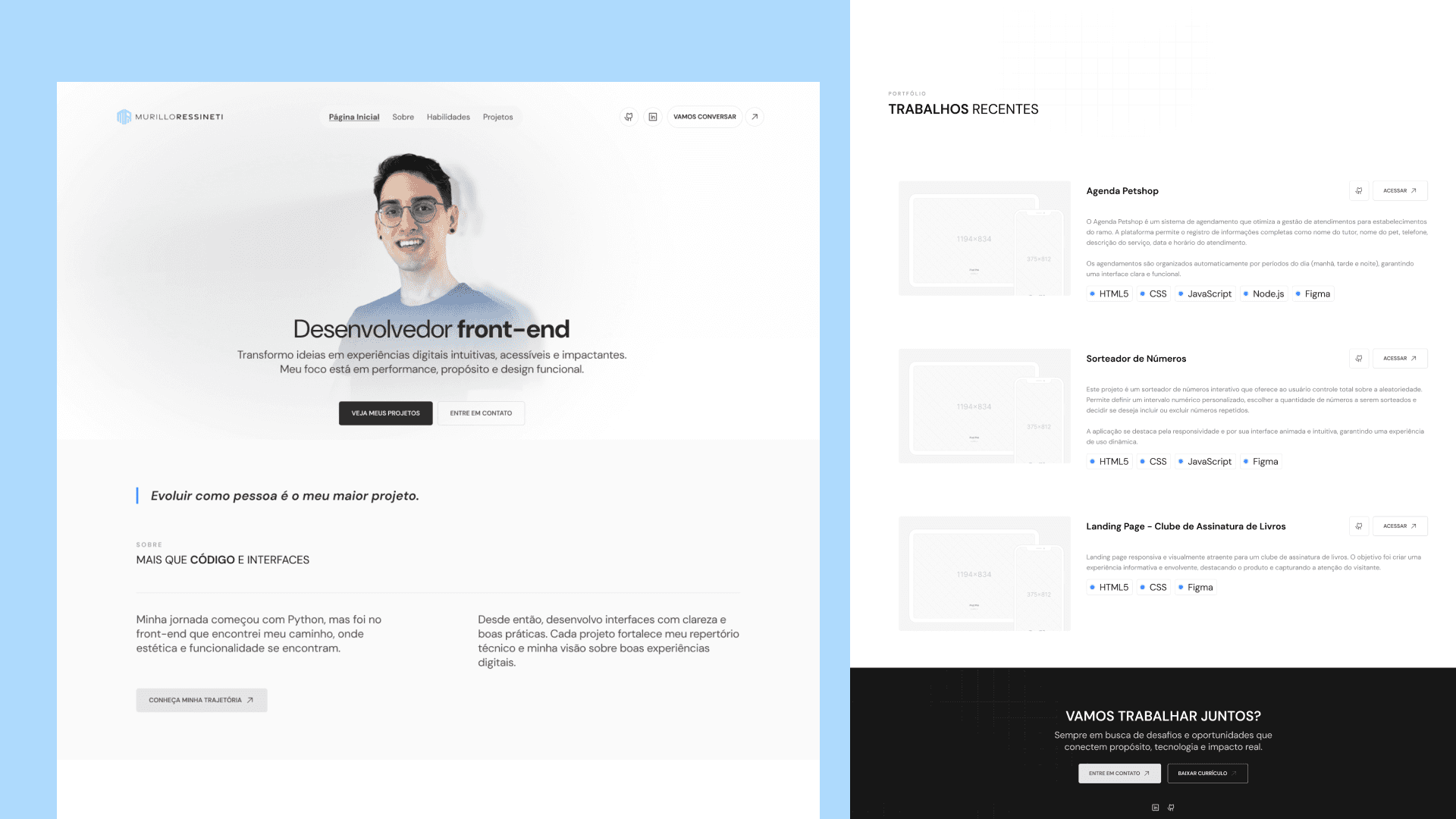
Solução Final
A design that reflects purpose, clarity, and confidence.
The new design delivers a smoother and more reliable experience:
Hero with a clear value message: “Front-end developer — performance, purpose, and functional design.”
Minimalist visual structure, emphasizing balance between code and design.
“Technologies” and “Challenges” sections repositioned to show real technical mastery, not just logos.
Footer reinforcing collaboration proposal and direct CTAs: “Shall we work together?”.
Impacto
More clarity, credibility, and a stronger professional presence.
After the redesign, the portfolio started to convey:
Visual authority and professional focus.
Greater clarity in the trajectory and personal values.
More natural flow until contact.
Better readability on mobile screens and greater text scanability.
Aprendizados / Reflexão
Balancing aesthetics, purpose, and narrative creates true connections.
This project reinforced the importance of balancing personal identity and functional clarity.
A portfolio should not only list projects but tell a coherent story — who you are, what you believe, and the impact you create.
© 2025 Thiele Santana. ready, set, create!